Project
Backup feature expansion & activation
Backup feature expansion & activation
Dropbox Backup / evolutions

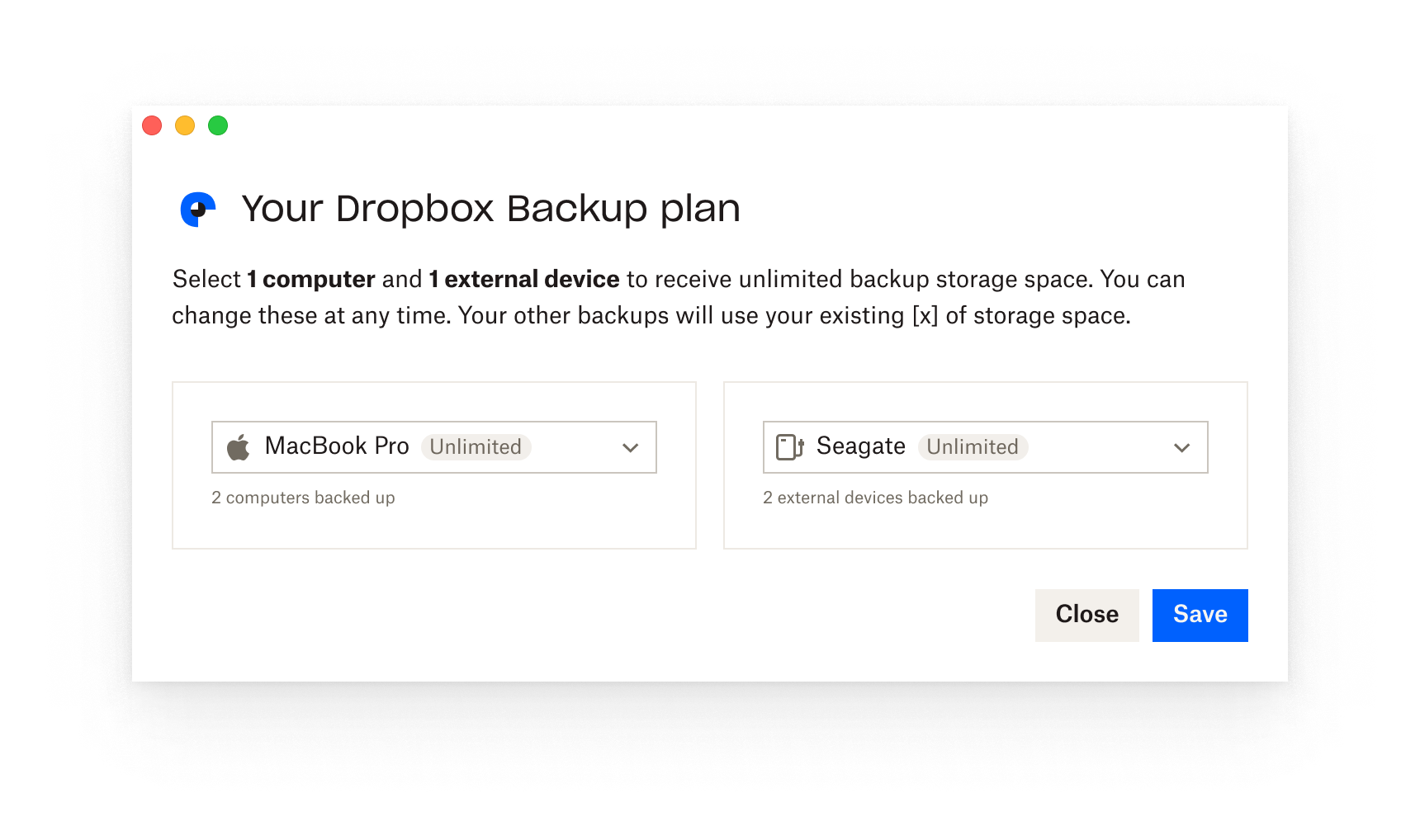
The Unlimited Backup feature is expanding! Instead of including just 1 computer, users can now have unlimited backup for 1 computer and 1 external device. Woot!
Is a modal the best medium for this part of the onboarding?
Can the information be ultra concise and decrease cognitive load?
How can iconography help make this information digestible?
Is the user seeing what they want in order to make the selection?
Is this a user-appropriate opportunity to increase activations?
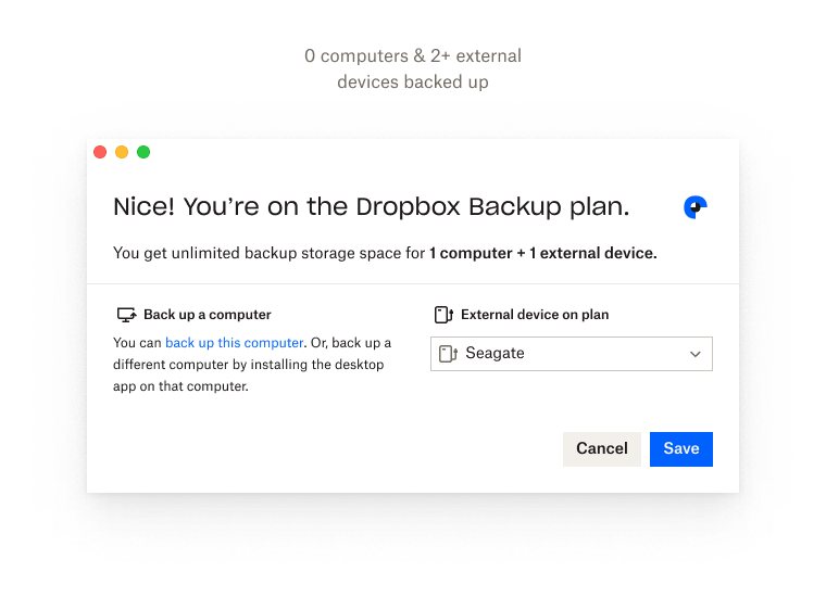
A year into Backup’s MVP launch, metrics showed that >90% of users had just a single backup. The existing radio button solution suited user needs well at the time, utilizing in-line scroll for a handful of users with over 2 backups.
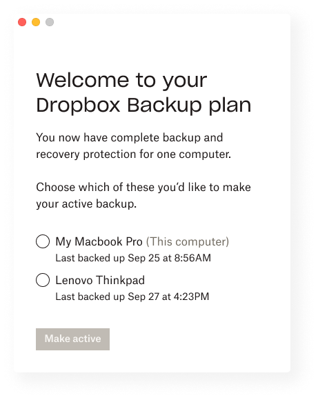
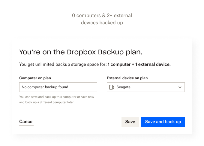
This modal is an important part of the paid onboarding for the Unlimited Backup feature. Users select 1 computer and proceed to the Backup desktop app (BTW they don’t have the ability to go back here and change the computer they selected 💔 – MVP4U).
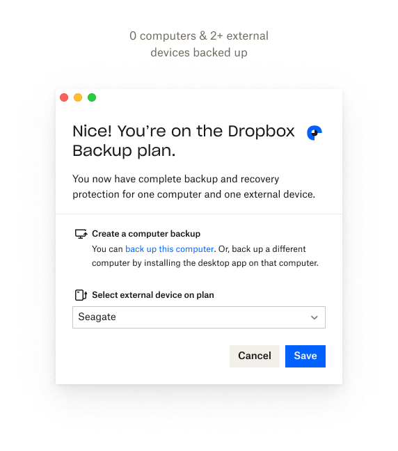
Modals can be disruptive, but in this context we need to maintain the user’s attention. Oh! Let’s use a dropdown (duh), they’re pretty scalable. And, maybe we can try to increase activations for users that don’t have 1 or both types of devices set up. PMs will love that 🥰 . Nice!
Alright, let’s apply these ideas to the use cases.
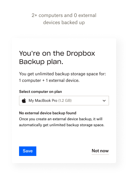
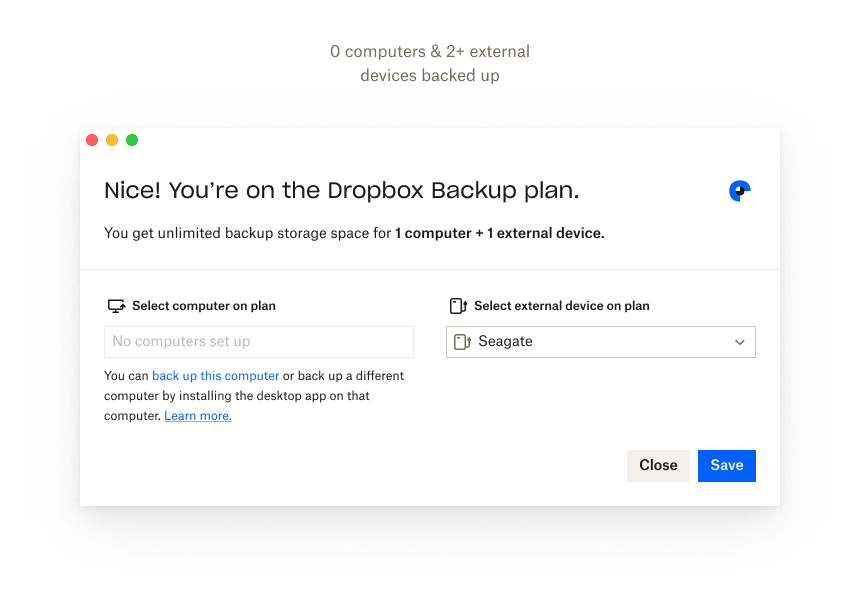
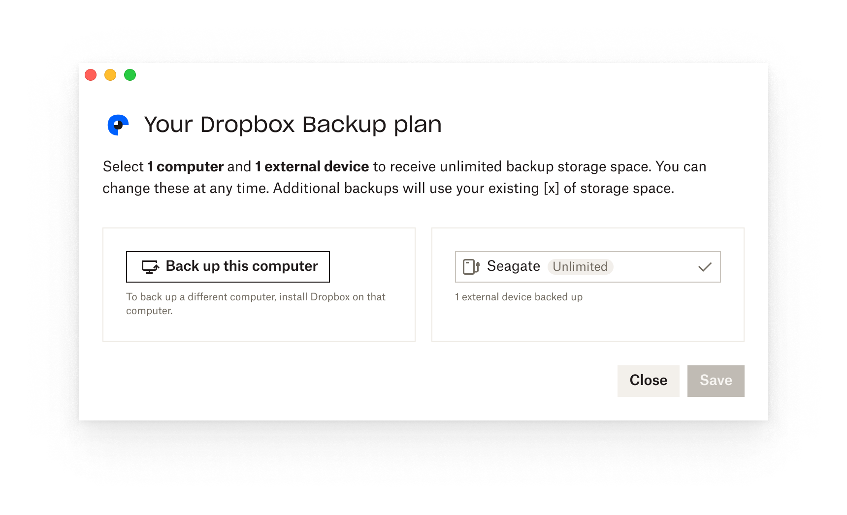
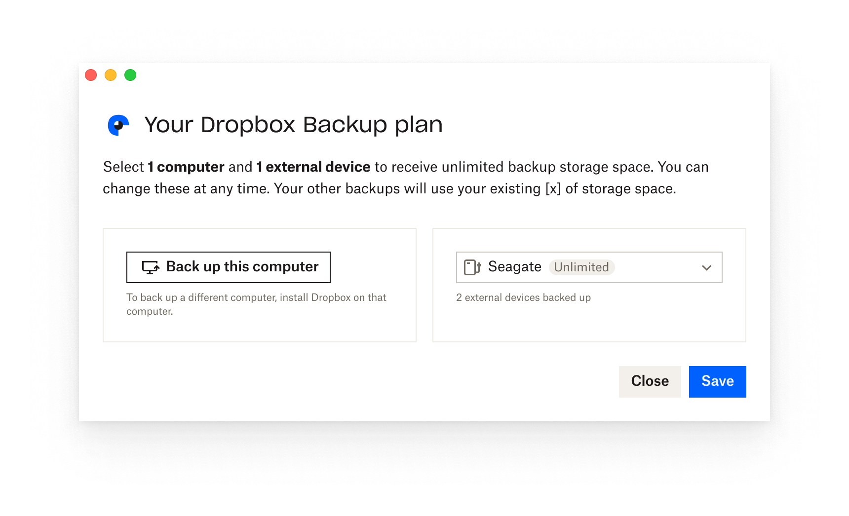
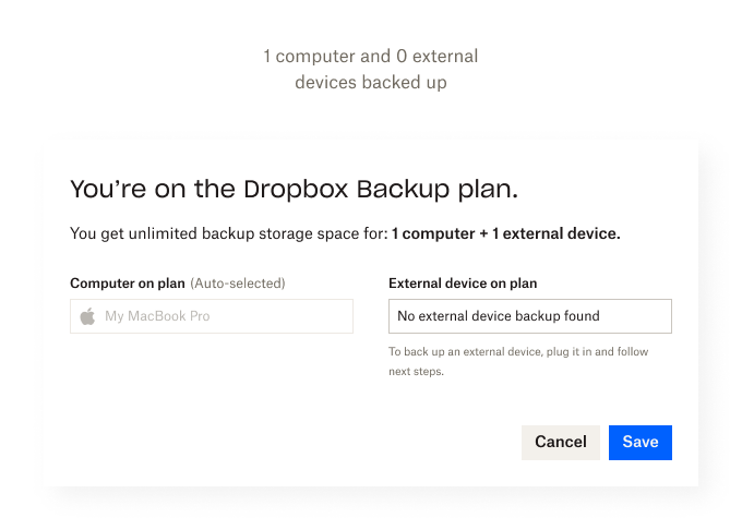
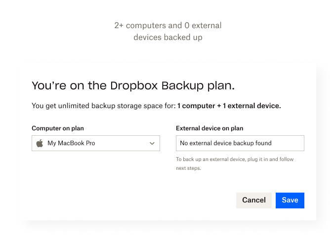
The dropdown works well + feels good but has introduced an interaction question: should a backup be pre-selected to avoid multiple clicks? How does this impact engineering cost?
The addition of icons should increase scan-ability, however, maintaining the same dimensions as the predecessor makes the modal feel cramped and heavy to digest.
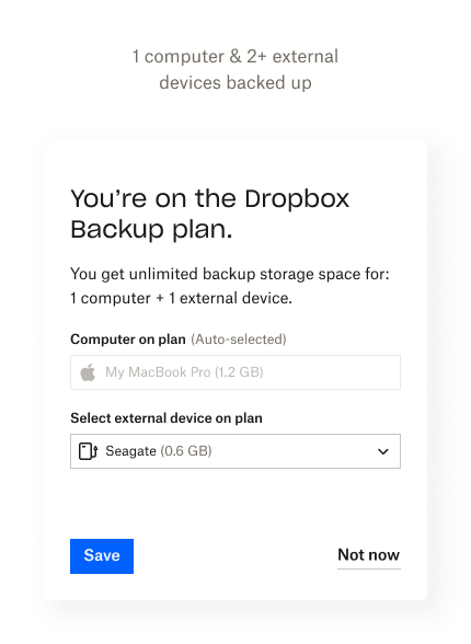
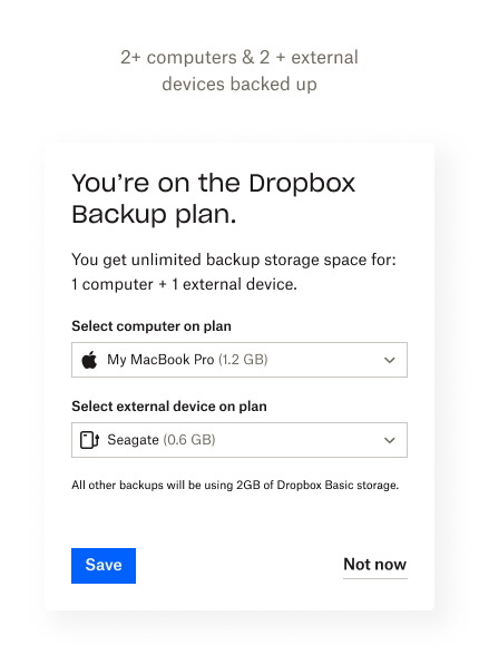
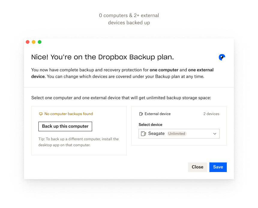
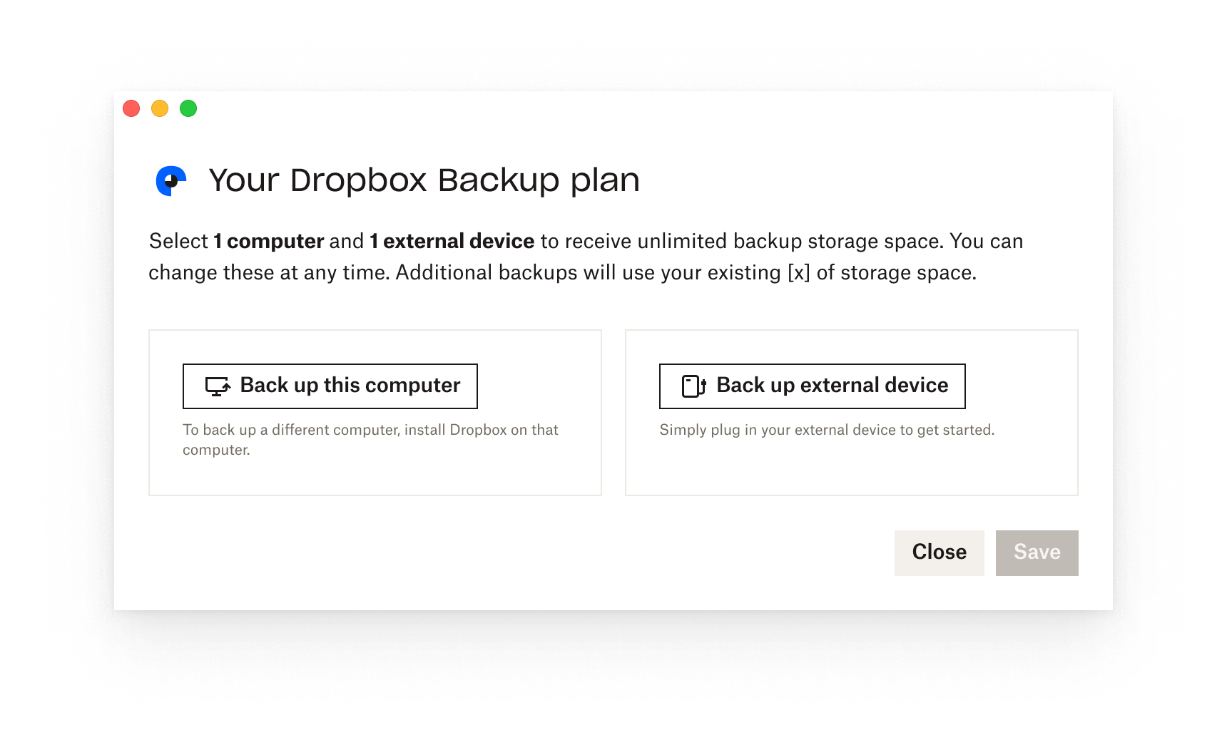
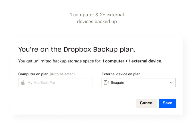
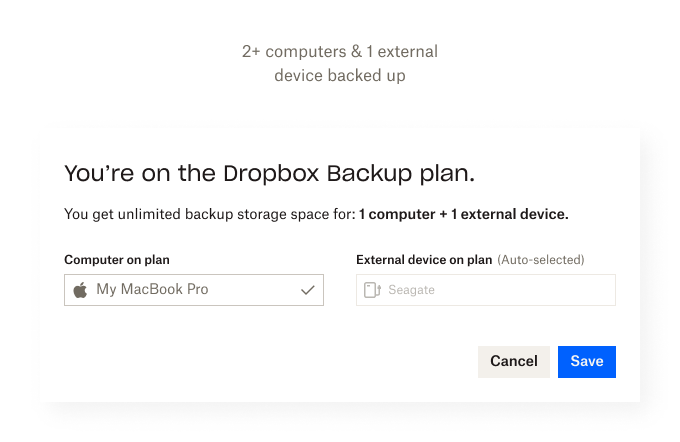
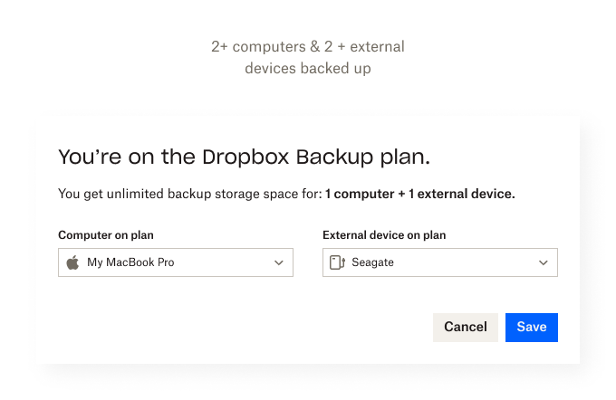
Let’s cut down on the words and switch to a horizontal layout to give us more breathing room. Maybe explore stronger hierarchy with text size and/or color. Let’s also discuss with ENG team if we can detect and auto-select the device(s) consuming the most storage space. 🧐
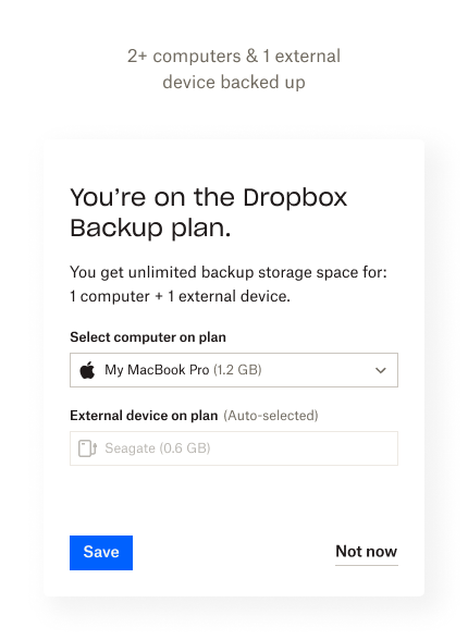
Looking good! The horizontal layout gives plenty of room to communicate and having both device types side by side is mirrored by the subtitle text. Nice!
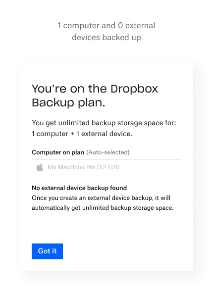
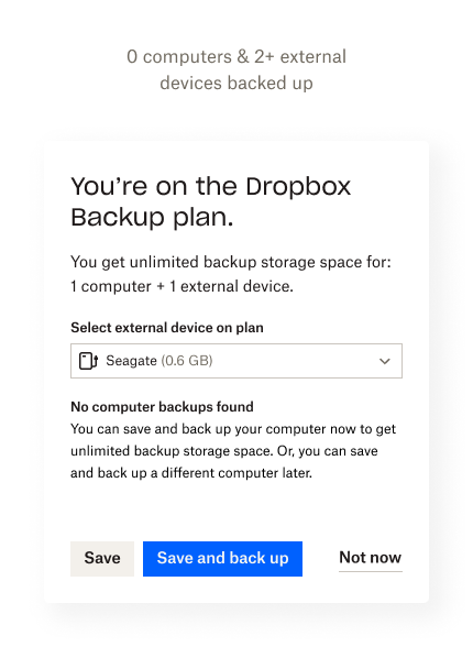
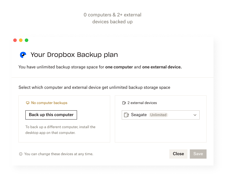
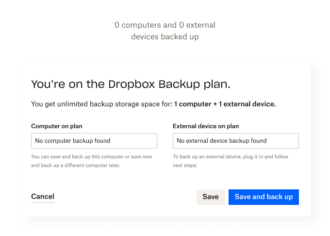
Fields without any selectable devices seem prominent but don’t do anything and using grayed out fields for a single device use case is definitely where the dropdown isn’t suitable. Contextual text is causing some use cases to have a lot of empty space.
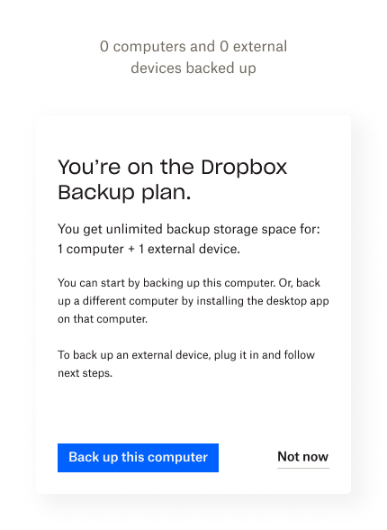
Onboarding users to start a computer backup is proving tricky and may derail users. Additionally, the onboarding for external devices works very differently.🤯
Keeping fields as placeholders when users have no devices is a no go, maybe introducing clearer CTAs can do the trick.
The content and hierarchy are headed in the right direction but we can still try to strike a visual balance between all the different use cases, while being mindful of what content will show up and when.
A total of 5 Dropbox customers were interviewed for 15 mins each. They were given a pre-planned scenario and asked to answer questions, complete tasks and take decisions within a prototype.
3/5 users were confident and accurate after 0-1 minutes spent on reading.
4/5 users found the iconography helpful to identify what an external device was.
5/5 users understood that there are two separate devices they can select.
5/5 accurately predicted the behavior of the dropdown.
2/5 users wanted some sort of time reference to differentiate between devices.
The modal is in a solid place now and serves all use cases well (that’s an opinion and time + research will tell🤞🏽). Future iterations to increase usability may include:
1. Throwing a component of time into the mix.
2. Working with CX to identify any confusion around content
3. Making onboarding consistent across different device types


