Project
Upcoming payments for Empower’s Thrive line of credit.
Upcoming payments for Empower’s Thrive line of credit.
UX strategy, Product design, visual design, information architecture.
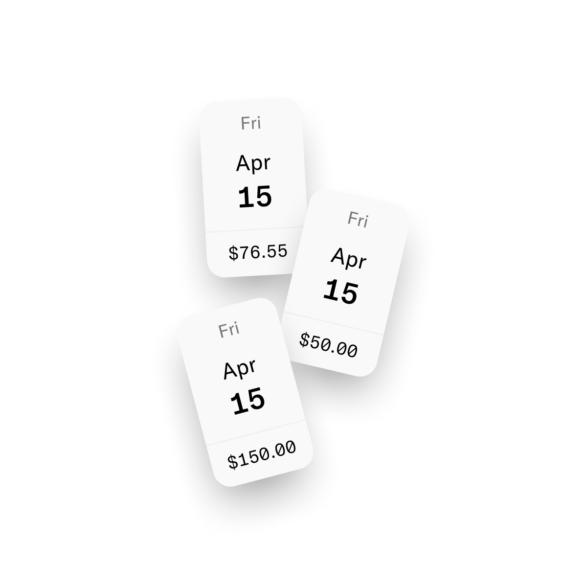
A significant number of Thrive (line of credit) users are expressing frustration to our customer support team. They’re reporting unexpected/unknown charges showing up on their checking account. Some users have complained about not having enough funds left over to buy everyday necessities. This is deeply troubling.
Low balances in our user’s checking accounts often lead to missed payments, which can result in late fees, added interest, and a negative impact on credit scores. HMW make multiple same-day payments clear and intuitive for credit-insecure users, helping them stay on track and avoid costly setbacks?
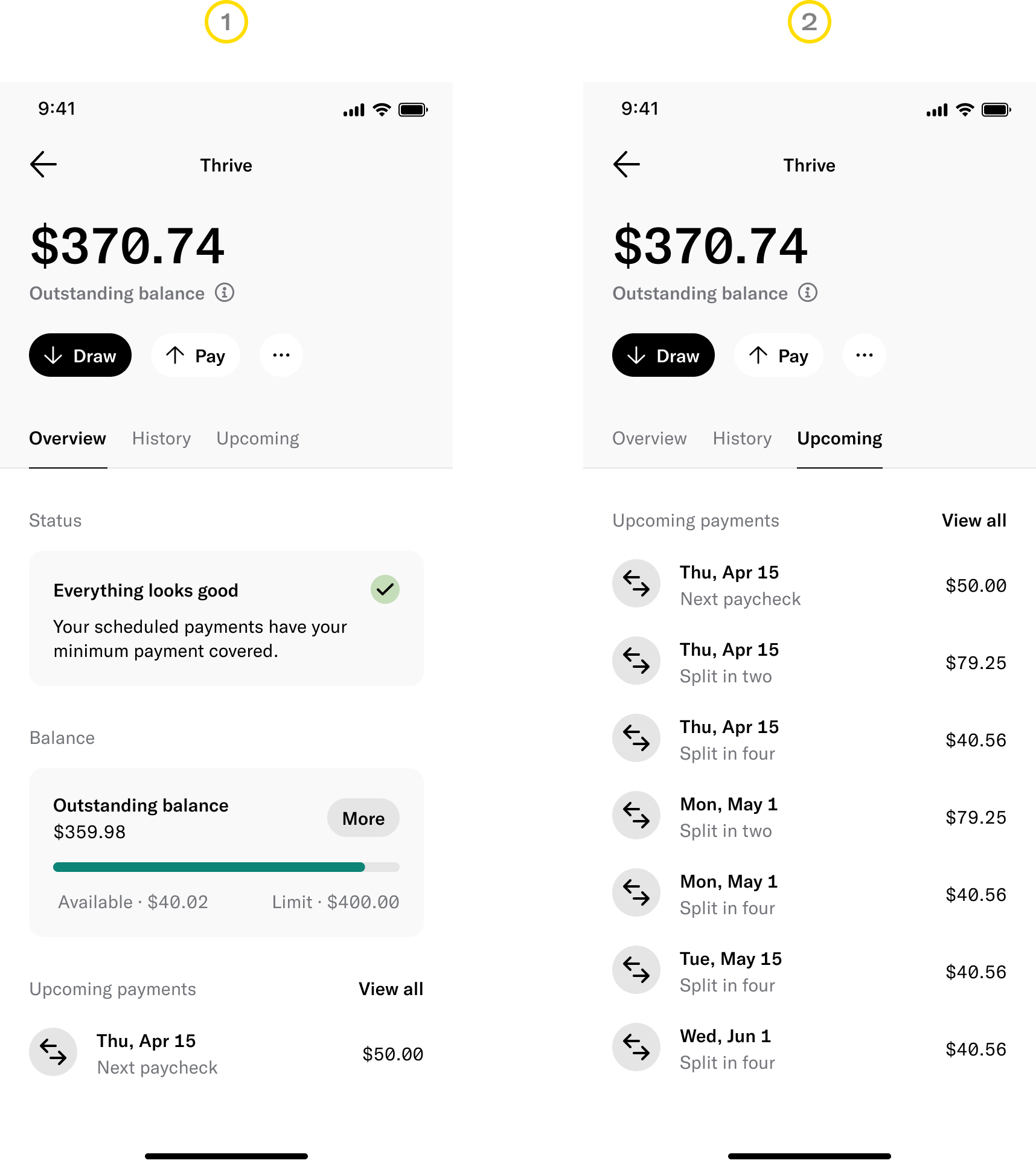
Thrive works by allowing users to draw funds (up to their credit limit) and schedule repayments that align with their paycheck dates. Pictured are two surfaces where users can view their upcoming payments:
1. The Overview tab, which shows only the next upcoming payment.
2. The Upcoming tab, which displays all upcoming payments.
1. Problem, Opportunity & insight (to orient solution generation).
2. User story and use case (step into Emily’s shoes).
3. See what Emily would see on the ‘Overview’ tab.
4. Navigate to the ‘Upcoming’ tab where Emily can see all her scheduled payments.
Tap on an upcoming payment to reveal hidden details. It’s hard for Emily, and many other users, to grasp the total amounts due on a specific day—since many payments can overlap on the same paycheck date.
Furthermore, the ‘Overview’ tab gives the false impression that Emily has only 1 payment of $50.00 due on April 15th, when she actually has 3 payments totaling $169.81!
Providing visibility and predictability around upcoming payments will enable users to manage their funds appropriately, decrease delinquency rates and alleviate pressure on customer support.
At Empower, our teams moved at lightning speed—opting for a ship-fast learn-fast approach. This was no different. I gathered insights from the customer support team and set off to explore and identify a quick and efficient solution.
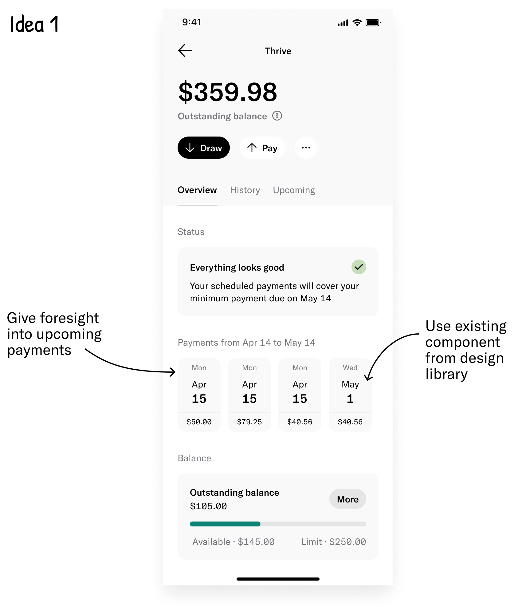
Visibility into upcoming payments is solving part of the problem. Users can see any overlapping payments that may be due on the same day but they will still have to manually add the amounts together to derive the total payment.
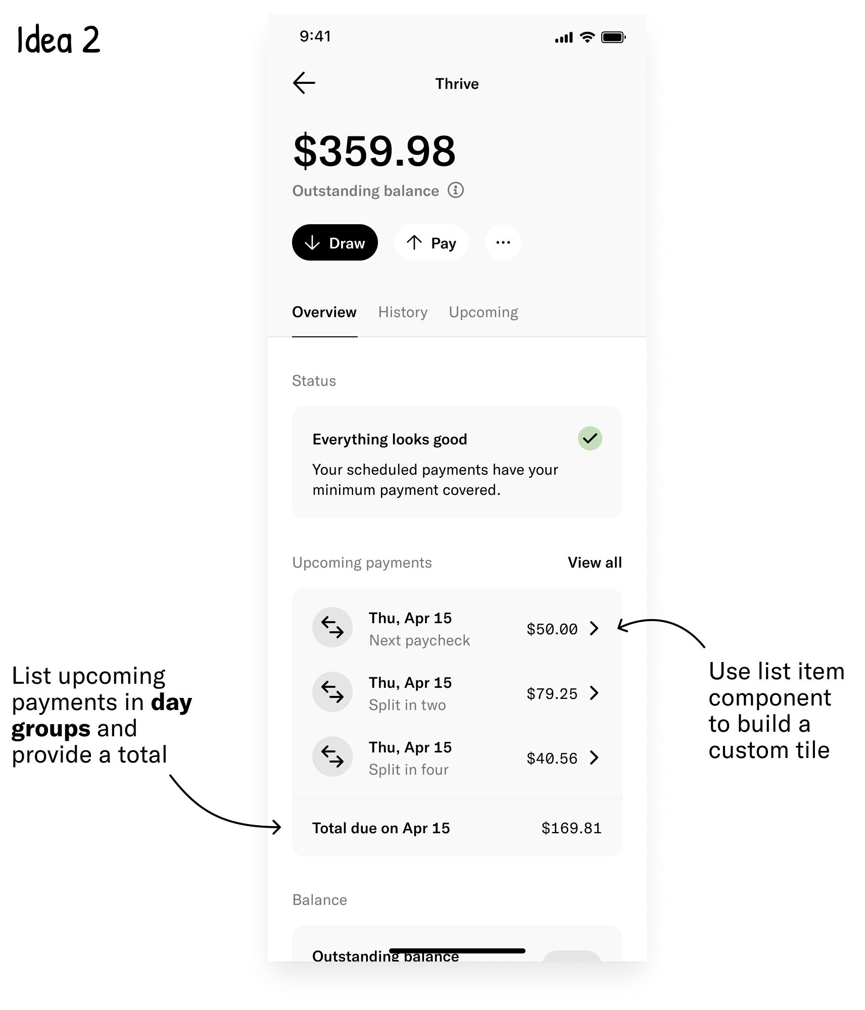
Grouping by day makes upcoming payments predictable, helping users prepare their funds in advance. However, this approach limits visibility into future payments while taking up considerable screen real estate.
The low-lift options aren’t solving the problem in it’s entirety. More explorations are needed, and I’ve had an idea! 💡
The concept is innovative and user-friendly, though the new pattern may present challenges in certain edge cases. For instance, when users have five or more payments grouped on the same day, interactability decreases as the collapse button falls off-screen.
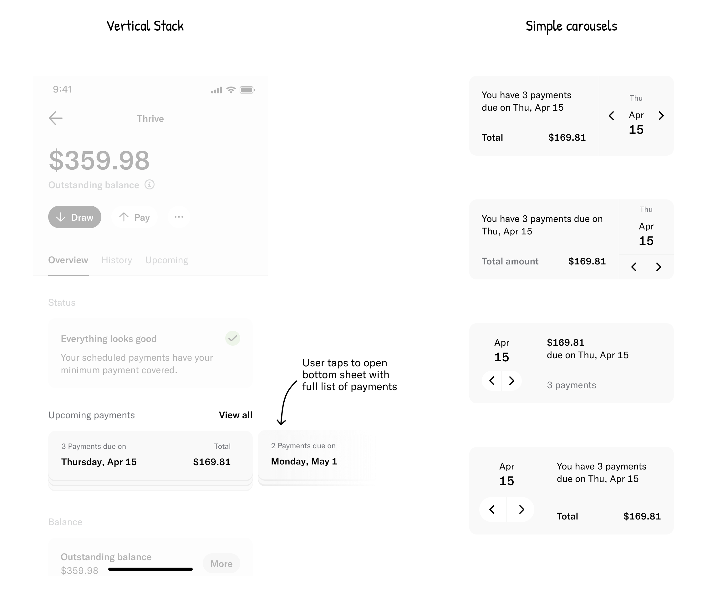
Designs from round 2 are well received and amounted to around a one sprint worth of work. But, one of the engineers shared that payments from the MinPay* feature would not be calculable into exact amounts. This complicated things a bit.
The ideal solution is an interactive experience that displays daily totals at a glance, allowing users to explore each upcoming payment in detail. However, this ticket was initially scoped for a single sprint, and implementing the additional design time and engineering effort would likely extend the timeline to 1.5-2 sprints.
I chose to refine the scrollable carousel, polish the content, and deliver a solution to users, prioritizing learning over perfection. Plus, I’d give myself time to address various other problems discovered during my discussions with engineers for a fast follow.
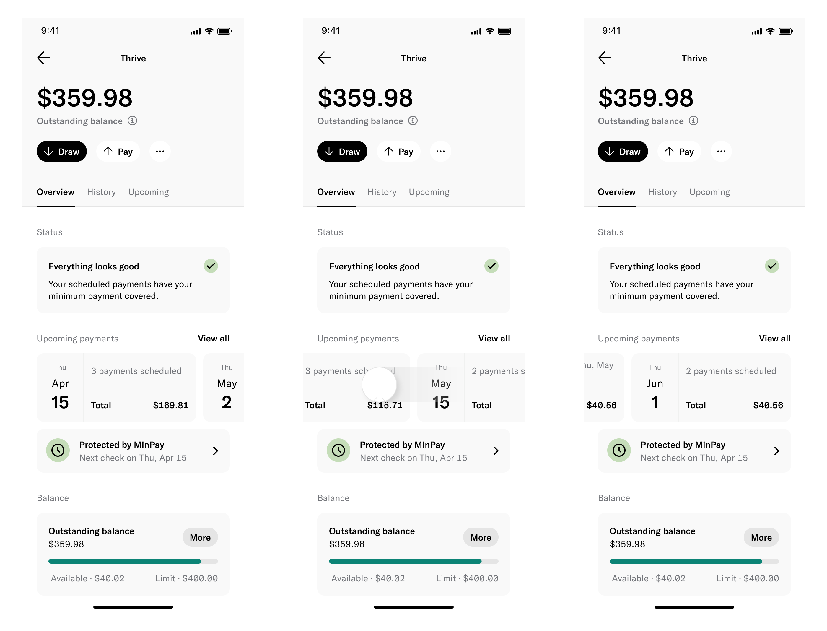
Even though we shipped a solution that wasn’t the ideal UX, we still ended up getting a positive signal for future upgrades due to a slight decrease in delinquency rates, and a sharp rise in collections over two weeks.